Sunday 8 November 2015

Liberty in Fashion


The new exhibition at the Fashion and Textile Museum combines two of my favourite things: fashion and florals. Liberty In Fashion charts the history of the famous London shopping destination and the impact the brand and its designers had on British fashion. At the grand age of 140, Liberty has seen many changes in fashion and design but has maintained its place as an iconic institution, pioneering beautiful prints and bohemian designs.

The exhibition itself is a treasure-trove of ditsy prints, intricate embroidery and bright colours. It starts with the company's early days when it was set up by Arthur Liberty as a warehouse supplying fashionable goods and textiles from the Far East in the 1870s. Liberty then moved into creating beautiful embellished gowns, befitting the wardrobe of a Downton debutante, as shown in the image of the delicate ivory capelet below.


The beginning of the 20th century saw Liberty embrace the idea of 'Aesthetic Dressing'. Long, flowing kimonos inspired by japanese paintings became sought after lounge wear for the bohemian woman. Liberty began to not only look to the East for inspiration but started to reinterpret the farm labourer's staple - the smock - for modern women. Smocks were loose, comfortable garments which carried with them an air of nostalgia for a rustic and rural life, but also hinted at the wearer's artistic temperament as the perfect outfit for painting and writing. I particularly loved this embroidered smock below, with it's palette of green purple and white echoing that of the Suffragettes' uniform.


The fashion for smocks also extended to childrenswear and both boys and girls wear dressed in these smart but loose-fitting tunics. Children's author Kate Greenaway's illustrations, which revisited the clothing styles of the 1880s and 90s became inspiration for Liberty's childrenswear. I found it fascinating that imagined dress from storybooks could lead to real-life changes in children's clothing and remember the vogue for this as a nineties child dressed head to toe in Laura Ashley floral smock dresses!


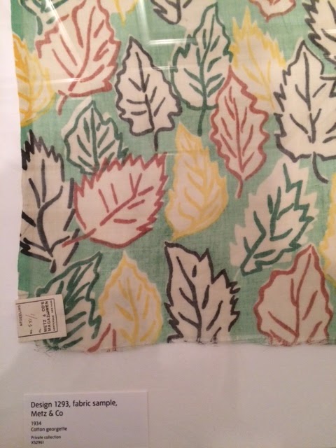
Perhaps what Liberty is most associated with is it's iconic ditsy florals. These rose to fame in the interwar years of the 1920s and 30s when small prints on dark backgrounds of black or brown where popular. The lighter, more optimistic blues and pinks were favoured in the 1940s and were often made into pretty tea dresses (see below). Just looking at these gorgeous war-time outfits, with their nipped-in silhouettes and bakelite belts cheered me up. You can see where Cath Kidston get some of their nostalgic print ideas from. 


Although Liberty reluctantly (to begin with) veered into more outlandish and vibrant prints in the 60s and 70s, when many of their prints were designed by the fabulous duo Susan Collier and Sarah Campbell, they returned to their trademark bohemian look in the 70s, with their floaty and romantic dresses (below). The smock dress made a triumphant return and prints were produced in beautiful muted browns and mauves. I loved the patchwork pinafores - they looked so practical and easy to wear.


Although I am probably biased, being already obsessed with prints and florals, I loved this exhibition of Liberty London. It was wonderful to learn about the shop's history, from its origins transporting textiles from across the world, to the work of its creative printmakers and design talents. Liberty will always hold a sense of nostalgia for me, but it was fascinating to see how often the brand has borrowed from the past to create something refreshing that echoes current fashions. Never more have I desired a few metres of Tana Lawn to make a ditsy print dress!

Let me know if you've been to the exhibition and what you thought of it - I'd love to know!

Liberty in Fashion is currently on at the Fashion Museum until 28th February 2016.


Sunday 25 October 2015

The painter that Britain forgot


The Towner Art Gallery in Eastbourne is one of my favourite places to visit when I'm back down south. It's a lovely space with great coffee and wonderful gift shop (containing these cushions of dreams). The Ravilious Room is really special and contains some of Eric Ravilious's most famous works, all featuring scenes of the beautiful Sussex Downs.


But the reason for going along this time was to see the Towner's latest exhibition: 'William Gear: The Painter that Britain forgot'. William Gear was an abstract painter working in the 1940s and 50s who produced some radical and highly controversial pieces. Autumn Landscape is perhaps his most well known paintings, deemed an extravagant waste of money when it won a £500 prize and was exhibited at the 1951 Festival of Britain. Although at the time this radical anti-establishment style of painting brought Gear fame and recognition, his work, both as an artist and as a pioneering curator at the Towner, seems to have been largely forgotten.


It was so inspiring to see and learn about these paintings, and to discover them anew. It seem such a shame that these incredibly dynamic works of arts have been hidden from view and have largely escaped the pages of art books. They form part of Britain's art canon and were an important part of that wave of artistic creativity that boomed in the 1950s.

William Gear's paintings are bursting with colour. I particularly like the two pieces below with their pale greens and lilac clashing and contrasting with the stark black patterns. Everything about his work seems vibrant and alive. I feel very lucky to have had a little glimpse into his world and learn a bit more about the history of the Towner and a forgotten artist whose paintings are now once again centre stage.


Sunday 11 October 2015

There's something about Audrey


Audrey Hepburn. Two words that conjure up more than simply one person. A ballerina, movie star, model, mother and Unicef ambassador - Audrey played more parts than seems possible to fit into one lifetime. Which is perhaps why the National Portrait Gallery's exhibition 'Portraits of an Icon' is titled so perfectly. Audrey Hepburn is iconic in that she can't be categorised. She lives on in films, in posters on the walls of student digs, on mugs and fridge magnets. She is everything and anything - a dream figure who everyone wants to be.

Audrey has been so often written about and discussed that she has become her own sort of cliché. The words gamine and elfish have been bandied about so often that they now seem slightly stale, especially when set against the actual photos. Looking at the many faces of Audrey in the NPG, was like discovering her afresh. The display maps out her life through photographs, from childhood days in Belgium, through ballet school and into her more famous and iconic years of the 1950s and 60s. Often set against the most plain of backdrops, Audrey is captured by photographers such as Richard Avedon, Cecil Beaton, Norman Parkinson and Irving Penn to show off her personality and grace rather than fashionable outfits. 


What I loved most about the exhibition was seeing Audrey photographed in more candid and spontaneous moments, in photos I had never seen before. Seeing her on set surrounded by cameras and chatting with cast members was fascinating and really showed a passion and enthusiasm for her work. Photos of holidays, days out with her children and even a shopping trip with her pet deer Pippin show give a small idea of her energetic - and somewhat eccentric - personality. Towards the end of the exhibition there is a collection of photographs showing her at work as a Unicef ambassador, a role she carried out for much of the 80s and 90s. It was lovely to see that there was so much more to Audrey Hepburn than we are often led to believe, and that there was a very real and genuine person behind the iconic beehive and cigarette holder now frozen in time.


Audrey Hepburn: Portraits of An Icon is on until 18th October.


I'm now off to watch Breakfast At Tiffany's!


Sunday 27 September 2015

100 years of Fashion Illustration


What is it about fashion illustration that makes my heart leap? There's something about it that I find just captures the essence of fashion, breathing life into clothes so perfectly, perhaps even more than photography. 100 Years of Fashion Illustration by Cally Blackman documents the changes in fashion illustration, from the thin art deco lines of the 1920s, to  the computer-led graphics of the noughties. What I love about these images is their ability to conjure up the entire feeling of the era in which they were published. Take Barbara Hulanicki's Biba girls; their oversized lollipop frames and doll-like eyes just scream the 60s. Whilst Celia Birtwell's drawings (below) have that unbounded sense of freedom and effervescence, like two Chagall figures gliding off into the night.


The book shows just how central illustration was to the fashion industry. These images were found on magazine covers, on dress patterns, in advertorials and on billboards. Fashion illustration dictated what what women should aspire to, it captured the whole feeling of the new season. Flicking through these pages, it seems that it was not merely the clothing that represented how women should spend their money, but the girl on page. She is often hidden under hats, glancing away, or completely absorbed by the letter or book she's reading. In short, these women, rather than staring out blankly from glossy magazine spreads, are shown to live their lives in these new fashions, whilst we are left to imagine the exciting goings-on in their lives.


My growing obsession for Mad Men has made me appreciate fashion illustration even more. Once considered to be simply adverts for products, many images of fashion illustration are now admired as museum-worthy works of art. Some of my favourites include Rene Grau who is known to have inspired David Downton, as well as Barbara Hulanicki's illustrations for her Biba designs.

Will the heyday of fashion illustration return? I really hope so! Instagram seems to be the best place for searching out talented illustrators who hark back to those good old days but are also creating something new and exciting. Some of my favourites working at the moment are: Kelly Marie Beeman, Drawing Feever and Unskilled Worker. Let me know any illustrators you are following at the moment, I would love to discover more. 

Have a great Sunday! Xx


Illustration credits: (
1) Bill Baker, 1966 (2) Celia Birtwell, 1970 (3) Marcel Vertes, 1940 (4) Rene Gruau, 1967 (5) Tod Draz, 1950 (6) Alfredo Bouret, 1957 (7) Rene Gruau, 1954.

Monday 31 August 2015

Beautiful Brighton


I think Brighton will always have a little piece of my heart. Although I now live over 100 miles away, I try and stop by as often as I can. There's just something about the city that makes me feel more myself. It's filled with memories of teenage angst, nights out, shopping with friends, vintage fairs, people watching. Earlier this year I was lucky enough to spent a month volunteering in the Brighton Museum, which is a beautiful building sitting just across the road from the Brighton Pavilion. I spent many happy hours cataloging and sifting through acquisitions books, marveling at their extensive collections of costume and decorative arts. The have a great permanent exhibition of ceramics and tea sets as well as chairs and furniture through the ages. It's all well worth a look.

It was wonderful to go back this Bank holiday weekend and potter around the same streets. We wandered through the North Lanes, stopping for a massive slice of carrot cake, rooting through the second hand bookshops and visiting my absolute favourite vintage shop 'Hope & Harlequin'. Perhaps one day I will have saved up enough pennies to treat myself to one of their fabulous dresses.

I also spotted some new (to me at least) graffiti art on one of the walls near the museum (see photo above). I love that it shows sketches of what looks like two sisters sitting together, as it's been lovely hanging out with my own sister the last couple of days. I hope you're having a relaxing Bank holiday and I will be back very soon with more posts on all good things like fashion, books and museums.


"I've never changed. It's like those sticks of rock: bite all the way down, you'll still read Brighton."
Graham Greene - Brighton Rock


Thursday 20 August 2015

Poetry in motion: Sonia Delaunay


Summer exhibitions at the Tate are always a treat, but I wasn't quite prepared for just how inspiring the Sonia Delaunay exhibition would be. To be quite honest, I hadn't previously heard much about her as an artist, but I decided to go in with an open mind, and I'm so glad I did.

On entering the first room, we were welcomed by Delaunay's incredible paintings. Each painting is divided into segments of vivid colours which fit together to create a whole. We learnt that Delaunay was heavily inspired by music and dance and was part of what was known as simultanism: a group of artists inspired by different art forms coming together. One of my favourite paintings was the image below of a young girl lying across a couch. I love Delaunay's focus on women as pensive and introspective, completely absorbed in their own worlds. Look closely and the young girl is made up of a range of hues, from sickly greens and yellows to bright reds, colour combinations that seem so unusual, but create such an otherworldly atmosphere.


What I found so wonderful about Sonia Delaunay as an artist was the sheer extent of her creative output. I found it incredibly inspiring that an artist explored so many different mediums so effectively to create her own complete world that was so distinctively hers. For a female artist at that time to have such creative freedom over every aspect of her work is inspiring and motivating, even today.

Aside from her work in abstract art and portraiture, Delaunay was also a successful fashion and textiles designer, creating dresses, shoes and beachwear, as well as working on textile commissions for department stores such as Liberty (see images below). Although part of a set of Parisian bohemians, she was not averse to more commercial enterprises, and fashioned designs for the forward-thinking modern women to wear. Delaunay is also known for her work on the costumes for the 1918 Ballet Russes production of Cleopatra, which were also on display. It was wonderful to see these pieces of ballet history, still intact nearly 100 years later.


Sonia Delaunay was also fascinated by the relationship between clothing and literature. Her idea for a 'poem dress' is something I found absolutely incredible. Delaunay collaborated with some of her poet friends to create dresses embellished with poetry, created movable figments of art. She also worked on a short story which she designed to be printed onto a long scarf so that with each fold, a new chapter could be read in small fragments. I completely fell in love with this idea of clothing and fiction complimenting each other and forming part of the same piece of art. I wish more designers would employ some poetry into their work.

My experience of Sonia Delaunay at the Tate was such an overwhelming but inspiring one. Delaunay was such a powerhouse of creativity and I defy anyone to not become motivated and filled with new ideas when visiting her work. I'd love to know what you thought of the exhibition if you managed to make it? Have a lovely weekend! Xx

Thursday 13 August 2015

Fashion on Film: Iris


Bug-eyed spectacles, bright red lips, and a shock of white hair. These are the components that make up the distinctive Iris Apfel. A fashion stylist, interior designer, costume collector and all-round tastemaker, Iris is the subject of a new documentary by Albert Maysles, creator of the fabulous 'Grey Gardens'.

As the film opens we see Iris, 93, in her natural habitat: the thift store. Her eyes light up as she picks beaded bangles and rhinestone encrusted bracelets, threading them onto her arms as high as her elbows. She talks of her favourite hobby, shopping, as an addiction, admitting she is always after the next fix. And it's the bartering, the thrill of the chase, the joking and the people that make the experience what it is.

The phrase 'like a kid in a candy store' couldn't be more apt here. Iris is drawn to cherry-coloured beads and bright amber necklaces, layering them up to create a look that is is completely unique. "I don't have any rules because I would only be breaking them so it's a waste of time" she tells the camera, and it's true. Iris lives out her style advice in full technicolour. 

It's not about the lavish designer pieces (although she owns more than a few of these), it's the process of seeking out treasures, be it from market stalls, thrift shops, or department stores, and building each piece up to create the full outfit. Colours, textures and shapes come together to allow for maximum visual impact. For Iris, getting dressed is the main event. You can feel her excitement as she examines the printed lining of a jacket or admires a work of embroidery. Her look is carefully layered to present a story to the to the world.

But it's her personality and pure zest for life that is most enchanting. For Iris, the world is a playground. She seizes opportunities as they present themselves. From interior design work, to collecting costume jewellery, to putting on her own exhibition at the Met, and of course this documentary: nothing is too planned in advance. There are no five year plans, checklists or the endless quest for money or approval. In fact she continues to be endlessly surprised at all the attention she receives. It seems that Iris is most happy bouncing around the house with her husband, who at the grand age of 100 still allows Iris to dress him in a studded snap back. They seem most content cracking jokes, messing around and telling fantastic stories.

As she says herself: "It's better to be happy than well dressed." And I couldn't agree more.

Saturday 20 June 2015

Shoes: Pleasure and Pain


I've always had a bit of a love-hate relationship shoes. Whilst on the one hand (or should I say foot?!) they can be undoubtedly pretty, stylish and glamorous, and give a much-needed boost to my 5 foot 2 inches, but they can also hurt like hell. Which is why the V&A's new shoe exhibition 'Shoes: Pleasure and Pain' is so perfectly named. 

On display are hundreds of shoes through the ages, each encapsulating a specific aspect of footwear. There is an area dedicated to shoes inspired by the fairy tale, including the iconic red ballet slippers worn by Moira Shearer in The Red Shoes as well as Lily James's glass heel from the recent Cinderella. Another display showed shoes worn by royalty, from Queen Victoria's pumps to Kate Middleton's nude LK Bennett's. 

The exhibition also delved into the more psychological aspect of our relationship with shoes. In a room hidden behind a velvet curtain were a collection of shoes chosen for their connection to desire and fetishism. For hundreds, if not thousands of years, shoes have been worn to reveal and conceal, and like any piece of clothing they say something about the wearer. In the 18th century, a fashion for shoes laced low on the foot was thought scandalous, as it revealed the wearer's coloured stockings beneath. And, of course, who can forget the stiletto, synonymous with femininity, sex, power, and one Carrie Bradshaw.

Pleasure and pain go hand in hand when thinking about the 'lotus' shoes worn by Chinese women right up until the early 20th century. These tiny, intricately embroidered shoes showed the extremes women underwent through the tradition of footbinding to gain a shoe size and gait that was deemed attractive. It's incredible to think that this was still in practise just a little over a hundred years ago.

Another aspect of the exhibition explored our need to collect and display shoes. Showing various shoe collections, from a society woman of the 1920s who kept her shoes in a specially made vanity case, to a more contemporary Reebok trainer collection, there is definitely something special about shoes that makes us want to cherish and preserve them, and showcase them as pieces of our personal identity.

A final showreel of cinematic shoe moments is displayed at the end of this expansive exhibition and if you ever needed a reason to re-watch the likes of Belle du Jour, The Red Shoes or Sex in the City, you'll want to now, if only to observe the beautiful shoes.


Thursday 4 June 2015

The Secret History of Wonderland

Alice in Wonderland fever is everywhere at the moment. The much-loved story turns 150 this year, and unless you've been living under a rock you might have noticed a few white rabbits, mad hatters and March hares cropping up around the UK. I've always felt a connection to these stories, and now that I'm living in Oxford, I'm not too far from where Lewis Carroll first met Alice Liddell, and where it all began.

A few weeks ago I was lucky enough to win a couple of tickets to the Charleston Festival, and of course I chose the talk on Alice. 'The Secret History of Wonderland' took the form of a conversation between two writers. The first, Robert Douglas-Fairhurst, recently published a book entitled 'The Story of Alice' which chronicles the life of Charles Dodgson (Lewis Carroll) and his relationship with Alice Liddell. The second author was Vanessa Tait, who is the great-granddaughter of Alice herself, and whose novel 'The Looking Glass House' retells the story of the Liddell family through the perspective of their governess.
It was fascinating to hear from Vanessa Tait about the experience of having such a famous relative, and one who was a literary heroine. Vanessa spoke about growing up in a house filled with Alice's memorabilia, from gloves and jewellery to treasured first editions of the Alice books. There is a real sense of mythology surrounding the story of Alice, from the photographs of her as a street urchin staring unflinchingly at the camera, to the nature of her relationship with Charles Dodgson, so much is unknown and unexplained, and both authors spoke of this uncertainty openly. Whilst we'll never know many of these unanswered questions, there must be something special about Alice in Wonderland. The book has become such a widely used cultural reference, from Japanese Harajuku costumes to Beatles lyrics. I can't wait to go back and reread the stories and be inspired once again.

These photos are of the house and gardens of Charleston, which is just so beautiful in the summer months. See last year's review of the festival here.

Have a great weekend! Xx

Saturday 30 May 2015

Riviera Style

Over the Bank holiday weekend I took the opportunity to visit the new exhibition at the Fashion and Textile Museum in Bermondsey. The FTM is one of my favourite museums, in part due to its very chilled and friendly atmosphere: you really feel that you can get up close and personal with the clothes and I always leave with my head full to the brim with inspiration.

The museum's latest offering is 'Riviera Style: Resort and Swimwear since 1900'. On display is a wide variety of beachwear throughout history, spanning Edwardian-era knitted bathing costumes, to fifties patterned playsuits and the more revealing cut away bikinis of the 60s and 70s.
The swimsuits from the turn of the century were perhaps the most fascinating to see in real life (see below). I was amazed how these little pieces of fashion history have survived all these years. The demure pantaloon-style suits were made of thick cottons or heavy wools that soaked up the water like nobody's business, making for a challenging paddle in the sea. Never have I felt more grateful for the invention of lycra!


It was only until the early 60s that truly practical swimwear really took off, until then there was a lot of making do with hand-knitted costumes and shearing elastic which sagged and filled up with water when you attempted to leave the pool! But the lack of synthetic fabrics and swimwear technology was not at the expense of style. The 1920s and 30s, one of my favourite eras on display, was when 'riveria' style was born, and beachwear became chic and glamorous. As you can see in the photo above, Japanese-style kimono jackets and slouchy pyjama bottom in gorgeous prints were all the rage, as were chic rubber swimming caps much like those worn by Keira Knightley in the film Atonement. 
Many of the items on display were of course nautical-inspired. Blue and white stripes, anchor motifs and brass buttons were in abundance throughout almost every decade. Sailor suits were popular as childrenswear at the turn of the century, thanks to Queen Victoria's penchant for dressing her children in them (even as a 90s child was put in an M&S sailor suit aged 2!). There is also a whole room dedicated to Amber Jane Butchart's new book 'Nautical Chic' (I reviewed it earlier on my blog here) which goes into more detail about our fascination with sailor style, and it was lovely to see some of the clothing featured in the book out on display.

There's definitely something about the seaside that makes us want to dress up and show off. The image below shows outfits a family of four might don when taking in the sea air in the early 1900s. These heavily starched suits and dresses were probably not the most comfortable of outfits on a hot summer's day, but were perfect for to show off for Sunday best. Fast forward through the decades and beachwear still needs to impress. From the sumptuous, oriental-inspired kimonos of the 20s to the barely there monokinos of the 70s and the teeny-weeny Daniel Craig Speedos of more recent times, beachwear seems to have always been an excuse to flaunt our fashion credentials.
Although I'm not all too great at dressing for summer (I blame this on typically rubbish British weather), I now feel a lot more prepared after this exhibition and have an army of ideas for summer outfits. If you're in need of some summer style inspiration, or just fancy gazing at some beautiful pieces of vintage clothing, I'd heartily recommend popping along to the FTM for inspiration. I'm particularly coveting a floral playsuit or some wide leg trousers. Now to book that holiday! Xx